|
|
Forum List
>
Café LA
>
Topic
Studio Design and ergonomics
Posted by hawkvideo
|
Studio Design and ergonomics January 17, 2009 08:10PM |
Registered: 15 years ago Posts: 7 |
I'm trying to remodel my home office into an environment more conducive to editing. In particular, what light arrangement works best. Can anyone refer to resources i.e., vendors, magazines or books that might give me ideas regarding furniture, lighting, seating etc? Also if anyone has photos of their edit bay they would be willing to share, it would be much appreciated.
|
Re: Studio Design and ergonomics January 17, 2009 08:29PM |
Moderator Registered: 17 years ago Posts: 8,836 |
No bright wall colors, no mixed lighting, no ultra warm/cool lights, especially if you're going to be doing grading.
Rugs, or whatever for comfort. A little side table next to the editing seat for snacks and drinks is always good for long sessions.

www.strypesinpost.com
Rugs, or whatever for comfort. A little side table next to the editing seat for snacks and drinks is always good for long sessions.

www.strypesinpost.com
|
Re: Studio Design and ergonomics January 17, 2009 09:24PM |
Registered: 18 years ago Posts: 2,643 |
if it helps here is my set - up.
i have a custom L shaped desk where i can rest my right hand on the tbl as i use the mouse.
My walls are clay colored accept for 1 wall (8ft wide) that i have a complement color on.
Lights are important and you are gonna have to experiment a bit for your taste. However, i have french doors and a nice size window in my basement. I always open them in the morning cause i like the light. So, i went and found lighting that would be relatively close to the same light that comes in the window during the day.
I like soft lighting thats too dim to call bright and too bright to call dim. Its very easy on the eye. Though it does tend to lean a bit to the cool side its good for me. NO DIRECT LIGHT is my rule in the edit room. I think every light should be bouncing off the ceiling or the wall.
the light that bounce off the wall is cool but the wall is a warm color so there is some cancelation going on and the light end up right in the middle.
dont have a white or near white wall and don't have a black or charcoal grey wall. No crayon colors either.
at the left side of the desk i have a tbl that i sit my reels and deck on. It is 1ft lower than the desk because that makes it easier to just reach and get what i want.
thats how i feel most comfortable after about 7-10 re-designs of the same space.
""" What you do with what you have, is more important than what you could do, with what you don't have."
> > > Knowledge + Action = Wisdom - J. Corbett 1992 """"
|
Re: Studio Design and ergonomics January 17, 2009 09:31PM |
Registered: 15 years ago Posts: 7 |
|
Re: Studio Design and ergonomics January 17, 2009 09:33PM |
Moderator Registered: 16 years ago Posts: 3,410 |
|
Re: Studio Design and ergonomics January 18, 2009 12:40AM |
Registered: 16 years ago Posts: 61 |
For me the most important aspect is arrangement of sound and vision monitors: I have a 23" above a 30"; the sound monitors arranged in an equilateral triangle to the sides. Deck to hand on a return to the left; papers/notes on a return to the right.
My studio has blackout windows (I find this essential for CCing) and high ceilings and a big air volume for good sound. The desk is 2 metres away from the wall; this allows v. simple cabling and good for acoustics, too.
I use soft (25W) overhead track lighting except when grading.
The kitchen is in the other building?some days that's all the exercise I get!
This is what it looks like today:

pretty messy, and the outside door is open, but you get the idea. cheers, kl
My studio has blackout windows (I find this essential for CCing) and high ceilings and a big air volume for good sound. The desk is 2 metres away from the wall; this allows v. simple cabling and good for acoustics, too.
I use soft (25W) overhead track lighting except when grading.
The kitchen is in the other building?some days that's all the exercise I get!
This is what it looks like today:

pretty messy, and the outside door is open, but you get the idea. cheers, kl
|
Re: Studio Design and ergonomics January 18, 2009 12:57AM |
Registered: 18 years ago Posts: 2,643 |
for less than 80 bucks lowes or home depot has the cheapo solution.
i went to lowes and they have these small black lamps that are simply a black base and a long adjustable neck with a bowl.
I took 2 of those and put one on the highest tier of my desk then pointed it to the corner where the ceiling meets the wall and did the same on the other side of the room. I manually turn them on at night cause i do not have a switch wire but its a nice soft light.
I also have the energy efficient bulbs i think 10 watt very lo and cool in light color. you can get those for about 50 bucks a pair.
they also have the ones that point at the ceiling in a torch style. Those are very warm like a regular no thrills light-bulb. I had those before. I used a reflective tin that i painted deep slue with a tinted polyurethane let dry for 2 days. Then I brushed it with a steel wool to make the reflection soft and satin like and hung it over the light to combat the warmth. it was nice but the blue bothered me a little and i switch to the 1st set up.
a pair of those would be the 80 bucks. Don't use your ceiling light. maybe get a ceiling fan for that spot or only use it when you drop something really small.
look at your shadow on your desk. your shadow should be about 15-25% opacity and blurred when its 2-4 inches from a surface. My shadow is at about 15% but the light is really even thru the room and you can see everything very nicely.

""" What you do with what you have, is more important than what you could do, with what you don't have."
> > > Knowledge + Action = Wisdom - J. Corbett 1992 """"
i went to lowes and they have these small black lamps that are simply a black base and a long adjustable neck with a bowl.
I took 2 of those and put one on the highest tier of my desk then pointed it to the corner where the ceiling meets the wall and did the same on the other side of the room. I manually turn them on at night cause i do not have a switch wire but its a nice soft light.
I also have the energy efficient bulbs i think 10 watt very lo and cool in light color. you can get those for about 50 bucks a pair.
they also have the ones that point at the ceiling in a torch style. Those are very warm like a regular no thrills light-bulb. I had those before. I used a reflective tin that i painted deep slue with a tinted polyurethane let dry for 2 days. Then I brushed it with a steel wool to make the reflection soft and satin like and hung it over the light to combat the warmth. it was nice but the blue bothered me a little and i switch to the 1st set up.
a pair of those would be the 80 bucks. Don't use your ceiling light. maybe get a ceiling fan for that spot or only use it when you drop something really small.
look at your shadow on your desk. your shadow should be about 15-25% opacity and blurred when its 2-4 inches from a surface. My shadow is at about 15% but the light is really even thru the room and you can see everything very nicely.

""" What you do with what you have, is more important than what you could do, with what you don't have."
> > > Knowledge + Action = Wisdom - J. Corbett 1992 """"
|
Re: Studio Design and ergonomics January 18, 2009 11:18AM |
Registered: 18 years ago Posts: 2,647 |
a lot of what you'll hear from once source to the next is largely personal.
the basic rules are neutral colors. soft, reflected light (torchiers, directional desk lamps bounced off walls, etc...). direct task lighting anywhere you need to read. done.
as far as sound goes, the basic rules are - keep large flat directly opposed walls to a minimum.
bookshelves are great, rugs are great. sporadic textiles on walls can help. really anything to hamper direct sound travel.
anything beyond that is either personal taste or dictated by your space.
|
Re: Studio Design and ergonomics January 18, 2009 12:39PM |
Moderator Registered: 18 years ago Posts: 6,730 |
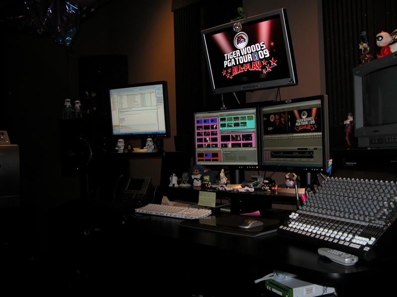
Here's a piece of my suite @ EA Sports (pre-MAC conversion that took place last week  ). It is the best atmosphere I have been in to date as far as color / lighting / sound for Post work:

COLOR:
As you can see...I LIKE IT DARK. The paint color on the walls I like to refer to as "Baby Sh!t Brown" - it is muted & matte. The ceiling is matte black.
LIGHTING:
All lighting is in the ceiling (4 small but powerful halogen units) that are adjustable to bounce off walls (nothing straight down) and they live on a main dimmer that is always at 50% or less. One desk lamp is around that I use occasionally (almost never - collecting dust). I don't like "up-lighting"...unless it is not distracting which is always the case, IMHO. Why light the ceiling? I never figured that out.
SOUND:
Sound absorption is key as well...multiple acoustical foam panels on every wall and thick units in the corners. Floor is industrial carpet so the chair can roll. The room is very dead...you can hear a dorito hit the carpet. I love that.
When life gives you dilemmas...make dilemmanade.

 ). It is the best atmosphere I have been in to date as far as color / lighting / sound for Post work:

COLOR:
As you can see...I LIKE IT DARK. The paint color on the walls I like to refer to as "Baby Sh!t Brown" - it is muted & matte. The ceiling is matte black.
LIGHTING:
All lighting is in the ceiling (4 small but powerful halogen units) that are adjustable to bounce off walls (nothing straight down) and they live on a main dimmer that is always at 50% or less. One desk lamp is around that I use occasionally (almost never - collecting dust). I don't like "up-lighting"...unless it is not distracting which is always the case, IMHO. Why light the ceiling? I never figured that out.
SOUND:
Sound absorption is key as well...multiple acoustical foam panels on every wall and thick units in the corners. Floor is industrial carpet so the chair can roll. The room is very dead...you can hear a dorito hit the carpet. I love that.
When life gives you dilemmas...make dilemmanade.

|
Re: Studio Design and ergonomics January 18, 2009 04:09PM |
Registered: 17 years ago Posts: 123 |
|
Re: Studio Design and ergonomics January 18, 2009 06:37PM |
Moderator Registered: 18 years ago Posts: 6,730 |
That is what's called a "dev kit"...it allows me to turn off music / menus / commentary in game for testing with Alpha / Beta game builds. I was told that unit is more than $10,000 and sent directly from Nintendo and if I break it - I bought it.
When life gives you dilemmas...make dilemmanade.

When life gives you dilemmas...make dilemmanade.

|
Re: Studio Design and ergonomics January 18, 2009 07:11PM |
Registered: 18 years ago Posts: 2,643 |
|
Re: Studio Design and ergonomics January 18, 2009 07:21PM |
Admin Registered: 18 years ago Posts: 3,512 |
I have a Wii for "business" purposes... Just finished Tomb Raider: Underworld... 

For instant answers to more than one hundred common FCP questions, check out the LAFCPUG FAQ Wiki here : [www.lafcpug.org]


For instant answers to more than one hundred common FCP questions, check out the LAFCPUG FAQ Wiki here : [www.lafcpug.org]
|
Re: Studio Design and ergonomics January 18, 2009 07:46PM |
Moderator Registered: 18 years ago Posts: 10,771 |
|
Re: Studio Design and ergonomics January 20, 2009 06:24PM |
Registered: 17 years ago Posts: 123 |
grafixjoe Wrote:
-------------------------------------------------------
> That is what's called a "dev kit"...it allows me
> to turn off music / menus / commentary in game for
> testing with Alpha / Beta game builds. I was told
> that unit is more than $10,000 and sent directly
> from Nintendo and if I break it - I bought it.
I work for GameTrailers.com and, IIRC, when we got our debug Wii (we call'em debugs as opposed to dev kits) it was delivered in a Brinks armored truck and had to be hand delivered by an armed guard to the Editor-in-Chief's office. It was a bit surreal to say the least.
-Andrew
Sorry, only registered users may post in this forum.


 All the news now and in your digital future


