|
   
| Product Review: ColorTheory |
August 20, 2001
Product Review: ColorTheory
By Charles Roberts
Product:ColorTheory and ColorTheory DV
Distributor:Toolfarm
Description: ColorTheory works as a standalone application for generating color schemes and quickly adapting any still image supported by the QuickTime architecture. It also works as a plug-in for PhotoShop, Illustrator, Final Cut Pro, After Effects and Commotion DV and Pro.
Cost: $149 (ColorTheory), $249 (ColorTheory DV)
It's pretty hard to think of software applications as inventions, but I ascribe to the definition of that word as provided by Professor John Frink, the freaked-out scientist character on "The Simpsons." To invent something, you "simply think of something that people need but which does not exist yet." By that definition, the ColorTheory application, devised by Matt Silverman and Garrick Meeker and distributed by Toolfarm, is very much an invention. I can't think of any application that performed the functions of this baby before, and I can't think of anyone, trained graphic designers included, that couldn't speed up their creative workflow with it.
The Basics of Color Theory
ColorTheory, the application, is based on color theory, the discipline, which some would call a science. Color theory is a system of relationships that seem to exist between colors in the visible spectrum. Many of us know the fundamentals of color theory; there is a color wheel containing all the visible colors, there are three primary colors distributed evenly around this wheel, and all other visible colors are located somewhere between the primary colors. What many of us should but don't know is that such a system can be used to arrive at color combinations that communicate and emphasize what we want. Sometimes, it's not what you say, but how you say it. Color theory is a tool for making a statement with color, without having to "say" it.
Color theory is a deep and involved subject, but for the purposes of this article, we can condense it into a few general rules. For every primary color there is an opposite color on the color wheel that is its compliment. Going by the color wheel, the opposite of a primary color is the color our eyes generally want to see it coupled with. Beyond the primary colors, all colors correspond in a similar way to their opposites on the color wheel. Complimentary colors tend to balance each other when used together, in a similar fashion to the way that musical notes can either harmonize or conflict, resulting in either a chord or a discordant sound. Whether a color is lighter or darker generally matters less than where the hue of color sits on the wheel. Green vs. blue is a far more important decision than light green vs. dark green.
Color combinations tend to act metaphorically. Clashing, non-complimentary colors generally convey a sense of aggressiveness and sometimes, even depth, due to the inability of the mind to resolve them. Complimentary colors on the other hand, usually convey a message of stability and balance, because the mind can comfortably place the two colors together. The main point here is that it isn't a choice of which color looks nice, but which color will or will not interfere with the colors already present. Color theory is about picking color schemes that work for your message.
Although it may seem somewhat mechanical, the relationships between the colors on this wheel have a long, long history. Even though the device called the color wheel wasn't formalized until the early part of this century, painters have used the same rules in combining colors on the canvas for centuries.. Probably more influential has been the use of color in advertising. Even though you don't know a thing about color theory, years of watching television and reading books and magazines has trained your eyes to see and interpret colors in a certain way.
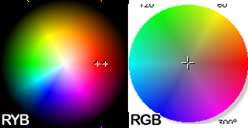 It used to be that you either received training in color theory and its application in graphic design or you made mistakes in color combinations until you learned what did and did not work. But there is another wrinkle that makes use of color theory principles difficult for even those with solid training. Classical color theory states that the three true primary colors are red, yellow and blue, making red's compliment green. But those of us working in the digital domain know that computer color is divided into the primaries of red, green and blue, making red's compliment cyan, a shade halfway between green and blue. When we work with a color palette in a digital application, we have to select colors based on a color wheel that shows a different complimentary relationship than the one that color theory says is accurate. It used to be that you either received training in color theory and its application in graphic design or you made mistakes in color combinations until you learned what did and did not work. But there is another wrinkle that makes use of color theory principles difficult for even those with solid training. Classical color theory states that the three true primary colors are red, yellow and blue, making red's compliment green. But those of us working in the digital domain know that computer color is divided into the primaries of red, green and blue, making red's compliment cyan, a shade halfway between green and blue. When we work with a color palette in a digital application, we have to select colors based on a color wheel that shows a different complimentary relationship than the one that color theory says is accurate.
This is a difficult place to work from in the world of designing graphics. Up to the present, selecting colors for use in an application meant figuring out the color relationships using a physical color chart, then trying to match that color with one in the color palette of the application. This can be a very stressful and time-consuming operation. One would think that software designers would have developed a way around this long ago but that hasn't been on the list of innovations that developers thought necessary. Until ColorTheory, that is...
ColorTheory, the application, aids both sides of this situation. It gives its user easy access to the benefits of the color wheel for selecting color relationships while automatically determining the RGB color that corresponds to the RYB colors you select. Instead of simply working as a standalone application or system color palette, it functions as a plug-in to several of the more important graphics applications that stand to benefit from its color juggling.
How Does ColorTheory Work?
The ColorTheory application can work as a standalone application for generating color schemes and quickly adapting any still image supported by the QuickTime architecture. It also works as a plug-in for Adobe PhotoShop and Adobe Illustrator, performing a similar function. For us video folks, it comes in very useful in Apple Final Cut Pro, Adobe After Effects and Pinnacle Systems Commotion DV and Pro. We apply the ColorTheory plug-in to a clip and then access its interface from the filter or effects window of the application we are using. Its functionality is generally the same in either video application, so although we will be looking at it inside of Final Cut Pro, expect similar processes from other applications with which it is compatible.
When you apply the ColorTheory filter to a clip in Final Cut Pro, a glance at the filter tab shows that the only attribute is an Options button. Clicking this button opens the ColorTheory interface window.
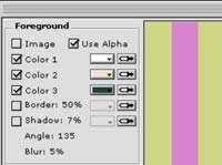
You will see a host of parameters and a video preview window. In the video preview window, you will see the clip to which you applied the plug-in, as well as a background pattern that stretches just beyond the edges of a DV codec video clip (720x480 pixels). By default, this background is a pattern of red stripes. Stripes are one of the many patterns available in the ColorTheory plug-in to choose from. The pattern you see in the background also appears in the clip in the sequence and can be seen if the clip the filter is applied to does not completely cover it.
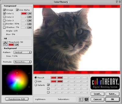
If your clip is a title or any other image that contains an alpha channel, ColorTheory can be set to use its transparency. You can turn off the visibility of the clip so that only the ColorTheory swatch pattern is visible while in the interface. Using this background of colored patterns as a test swatch canvas and the Viewer or Canvas window as a source, you can use the Foreground eyedroppers to quickly separate and isolate the principle colors of the clip.
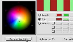
ColorTheory averages them out (up to three colors at a time) to find the hue that you want to use as your base color for building a palette. Then you choose one of the various classical color theory color formulas to generate different background patterns as a scratch pad to find a suitable color relationship. You can change the pattern to see how the colors work with each other in different situations . Once you determine a likely set of colors for your situation, you can save the color set and open it again later or you can use it right then and there in your clip.
Totally inexperienced with color and not sure what to choose? Simply get an averaged color with the eyedropper (or select a color based on your personal preference), pick a color relationship, then Randomize Edit, a function that generates different Lightness and Saturation values for the color you have chosen and its corresponding color from the relationship you picked. All randomized colors will be safely within the complimentary (or non-complimentary, depending on how your tastes run) color relationship you want, though they will vary widely because of the Lightness and Saturation variations. As you cruise through the randomly generated colors, you will see ones that you want to use. Simply store them in your selected color swatch pad and keep experimenting.
To use the plug-in with a Final Cut Pro text clip, set up the text generator clip in the sequence as you normally would. Apply the ColorTheory plug-in to it and then hit the Options button on the Filter parameter tab. Experiment with averaging out the most important screen colors of the video clip that the title clip will cover until you find a color you feel is prominent. Then select a color relationship that suits you.

After you've found the right set of colors, click OK to leave the ColorTheory window. Since the swatch background is visible outside the Color Theory interface, you can use the eyedropper in your text clip's Control tab to sample the color you want to use from the background swatch generated by the ColorTheory plug-in.
Then go back to the Filter tab, turn off the ColorTheory filter to make the background swatch disappear from view and you've got the text color you were looking for that compliments the background it was derived from. It's a pretty simple process that can yield palettes of color as complex as you want. The color combinations can be complex, but arriving at them isn't.
Much Ado About Text
With all this talk about text you'd think that's all we video people do.. Text color is obviously a very important use of ColorTheory, but there are other uses that may be less obvious. Color is something we see in all things and words aren't all we want to emphasize. One nice use I have found for ColorTheory is using the backgrounds and the color tools to generate interesting effects with Final Cut Pro Composite Modes and After Effects Transfer Modes. Since these Modes rely directly on the chroma and luma values of a clip, ColorTheory can come in handy as a tool for generating color variations and patterns that take advantage of the Modes in an organized fashion. It's one thing to randomly trick out footage using the Modes, but another to actually plan out your Mode effect based on the chroma and luma you generate from complimentary color palettes.
When you apply ColorTheory, the background pattern you use to examine your swatch in the plug-in's interface is visible until you turn it off in the Filter tab. I found that this gave me some pretty nice patterns for use as Composite Mode mattes.
Sure I could have generated such patterns as mattes in PhotoShop (with a lot of copy, pasting, cropping, color selection, etc.), but the 22 already available in the ColorTheory pattern bar are pretty fun. Plus, your complimentary color choices are automatically applied to the pattern from inside the plug-in making quick color mattes a breeze. The relatively small number of patterns is the only real limitation. Matt Silverman has indicated that two of the possible developments in the next version are the ability to add custom patterns and anti-aliasing of patterns, developments that would aid such uses.
ColorTheory has also been used to successfully color correct multicam DV camera footage. It can be difficult, if not impossible, to get several DV cameras color calibrated to each other. Achieving a consistent white balance between several prosumer cameras is almost impossible, even under the best of situations. After a multicam shoot, the headache starts with getting cuts to follow each other without noticeable variance. But ColorTheory can be used to literally map out color variations between multi-cam footage and provide a much more accurate basis for color correction. Just generate a common palette and color correct from there. This is only scratching the surface of the possible applications of ColorTheory. Anyone who needs to attain precise color will benefit from this tool.
Problems? What Problems?
The only real problems I saw with using ColorTheory were within Final Cut Pro itself, and were not a failure of ColorTheory. Final Cut Pro's implementation of After Effects plug-ins yields some annoying screen re-draw delays. Although the workarounds are simple (tweak the Blend slider or some other parameter to force a re-render of the frame), it would be nice if Apple boosted the plug-in support to eliminate this problem. There is no such trouble using Color Theory with After Effects or Commotion and the standalone and PhotoShop plug-ins also worked without problems.
The ColorTheory DV version can provide FireWire preview output as long as no other application is hogging the FireWire port. This means you need to disable FireWire output from one application or the other. Although that may sound problematic, it isn't for two reasons. If you are using ColorTheory as a plug-in with another application that uses FireWire, like Final Cut Pro or After Effects, you can use that application's preview capability for the same purpose. And frankly, for those with a dual monitor set-up, I found that switching the second desktop monitor over to full-screen previewing the ColorTheory swatch was a much better way of examining the color schemes. The only reason that FireWire output becomes necessary is to test the color schemes for NTSC legal range with scopes, which is easy enough to do once you've picked your poison.
Usually, the weakest link in plug-in and application development is documentation and training materials. When the whole development team can fit in a Volkswagen, it's likely that the manual is going to suffer neglect more than the coding. In a rare instance, this is not true with ColorTheory. This is, after all, Matt Silverman of the Commotion Complete instructional tape series. ColorTheory is accompanied by a reasonably thorough manual; although the manual needs to be updated to the new 1.2 version of the software, nearly all of it is still valid since 1.2 only ADDED features. ColorTheory also comes with about an hour's worth of an excellent QuickTime Movie video tour of the ColorTheory application, which explains the how and the why. This tour is actually available for download along with a time-expiring demo. Trust me, you'll get it, you'll watch the video, you'll use it a couple of times, then you'll want it.
The Bottom Line
ColorTheory is a tool. It is not penicillin. It will not make your bad designs disappear magically. It is not a CRASH BAM ZOP plug-in that you just apply to bad looking work to make it better. It is a tool for giving you choices with color, to make color work for you instead of the other way around.. It is one of those tools that makes you learn and these are the best tools around.
If you've ever wondered why your text doesn't look professional or why some people just seem to magically produce good-looking titles, ColorTheory might solve 90% of your problems by making you understand why. If you have never used a color other than black or white for titles for fear of generating messy results, ColorTheory will explain a great deal. Even if you only use it as a learning aid to ingrain the visual color system, it would still be worth the asking price, and it can do so much more. Color Pickers and System Palettes have always been a weak spot in computer operating systems, and we should all take advantage of one that is designed for the user rather than the hardware of the computer.
Charles Roberts AKA Chawla teaches Digital Video and Audio Production at Fitchburg State College in Fitchburg, MA. He uses his long tedious rendering times to generate content and tackle hard hitting issues on the discussion boards of 2-pop FCP Home Page.
copyright © Charles Roberts 2001
|